The Play That Goes Wrong, 2023

Trace Carnell Clothier, 2023

Das Triadisches Ballet, 2023
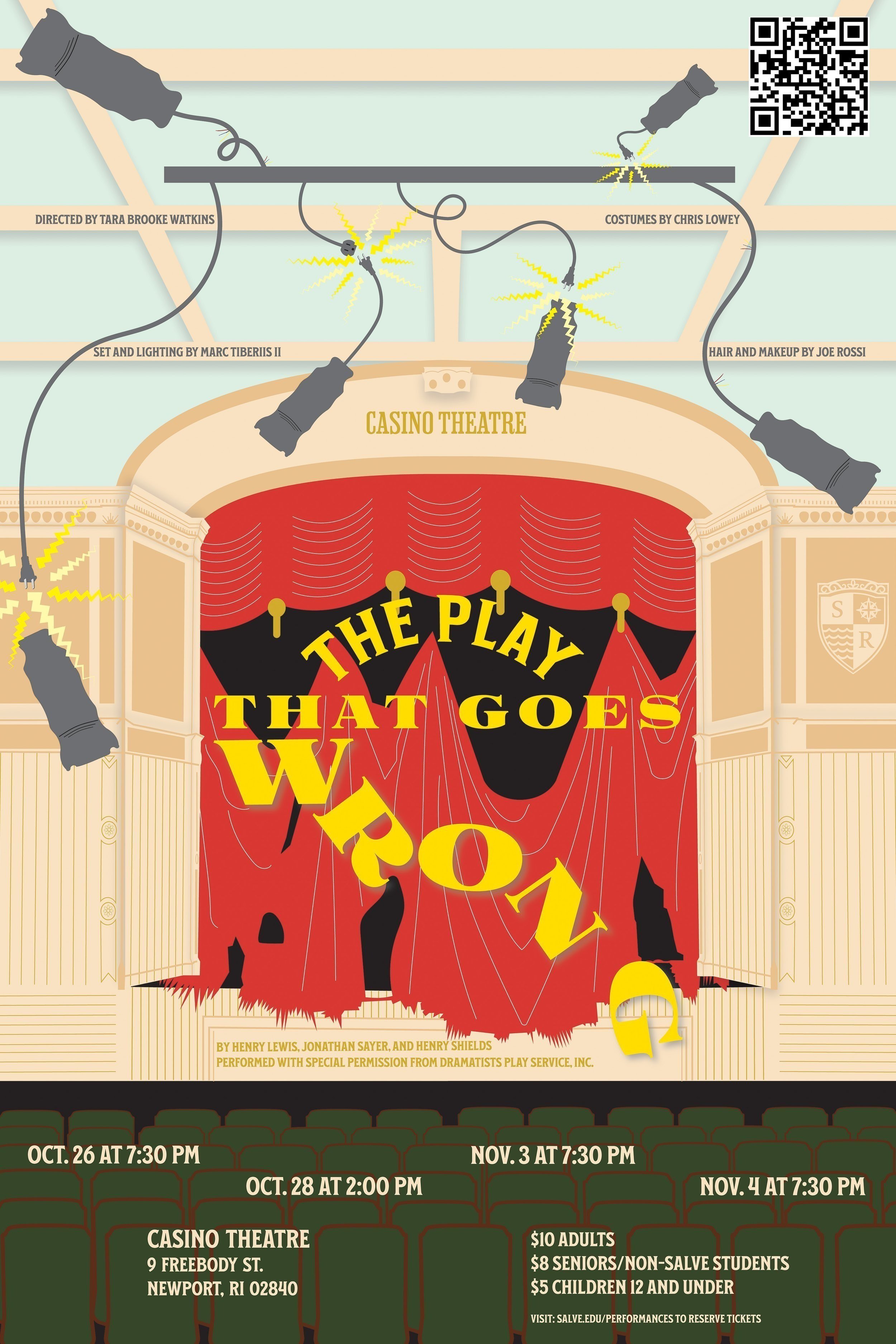
This poster was created to promote Salve Regina’s Department of Music and Dance and their production of The Play That Goes Wrong. My design process began with a detailed design brief that outlined the director’s preferences, providing a clear direction before I developed my initial concept. Since the play was performed at the Casino Theatre in Newport, Rhode Island, I drew inspiration from the Gilded Age architecture of the venue to capture the comedic chaos and stage destruction that unfolds throughout the play. The design blends elements of American musical theater’s 1920s “Golden Age” with a contemporary perspective, reflecting both the historical context and modern sensibilities. This project was part of a contest held by Salve Regina’s Department of Art and Art History, and my poster was selected for use in promotional materials, including the playbill and posters to advertise the production to the Newport community.
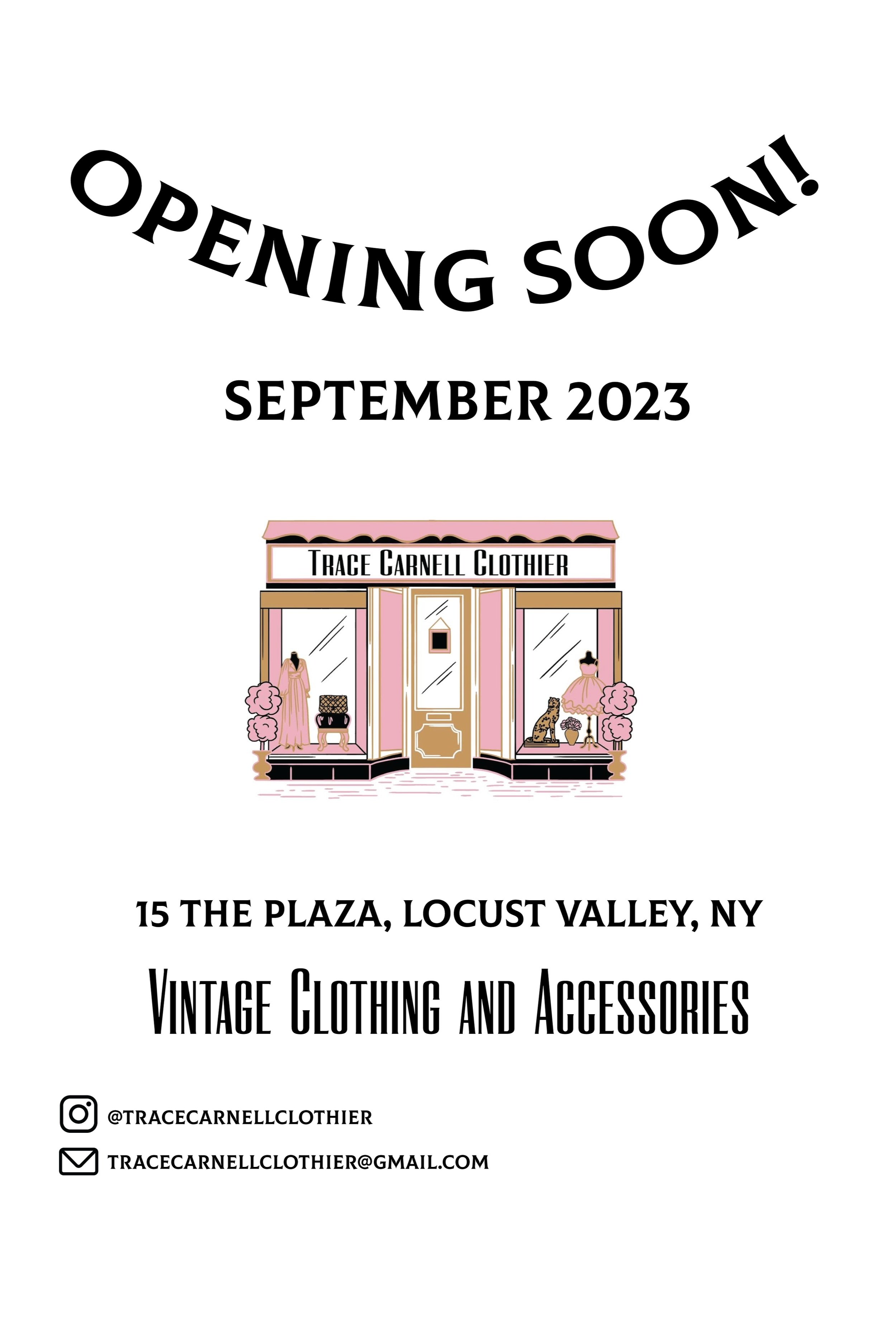
This poster promotes the grand opening of a new location for a vintage clothing store in Long Island, New York. In collaboration with the shop owner, I designed the poster to reflect the store’s feminine yet bold aesthetic. Drawing inspiration from the business’ existing logo, I selected two cohesive fonts harmonizing with the brand’s identity. Throughout the design process, I focused on ensuring that the poster complemented the existing logo without overshadowing it. To achieve this, I chose black typography on a white background, allowing the logo to remain as the focal point for the viewer's eye. The goal was to deliver a clear and compelling message to potential customers while maintaining the integrity of the brand’s signature style.
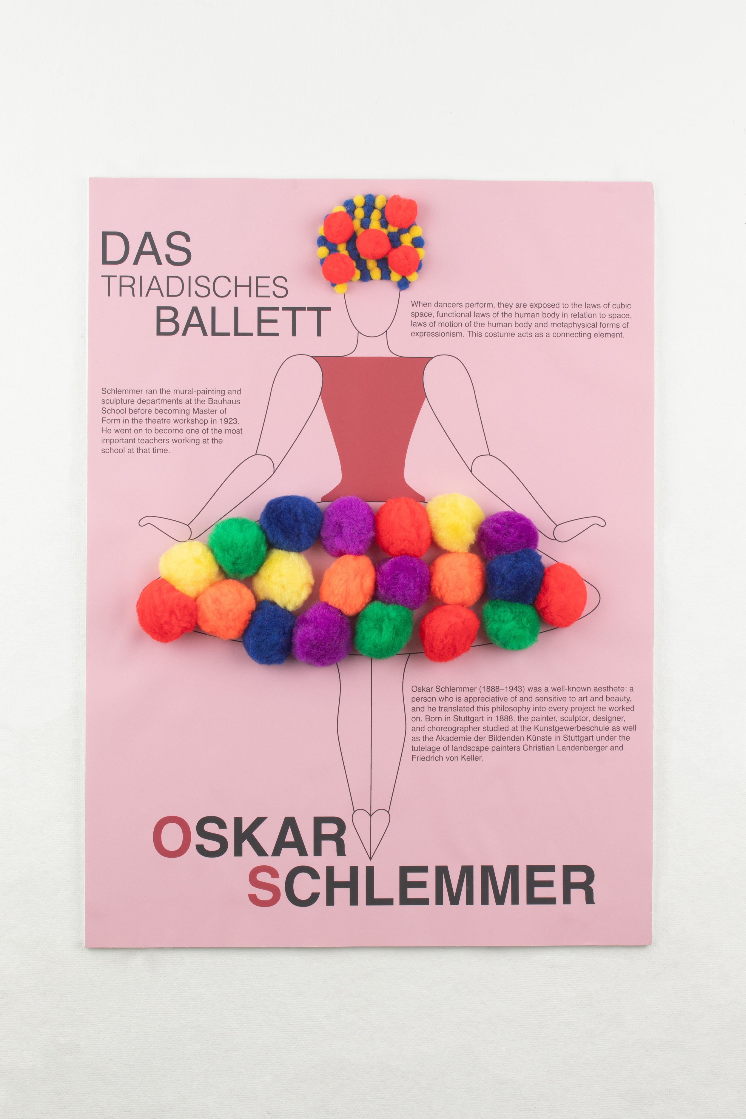
An interactive poster that uses sight and texture to engage the viewer through the poster of the International Typographic Style (Swiss Style) to create a poster inspired by the Bauhaus painter, sculptor, and teacher Oskar Schlemmer. Schlemmer’s Triadic Ballet, in 1922, combined dance and costume design to create mechanical and geometric performances. Out of the twelve choreographies and eighteenth costumes in Schlemmer’s work, I chose a costume with primary colors: red, yellow, and blue tutu. The pom poms represent the round spheres on the costume and are the textural element that invites the viewer to touch the poster.